Your Friendly Neighborhood Marketing Agency
My sister is a marketing mastermind. We worked together on creating this brand whose main purpose is to communicate that there is hope for small, neighborhood businesses to get personal and cost effective digital marketing help.
Learn More
Symbol And Logotype Lockup
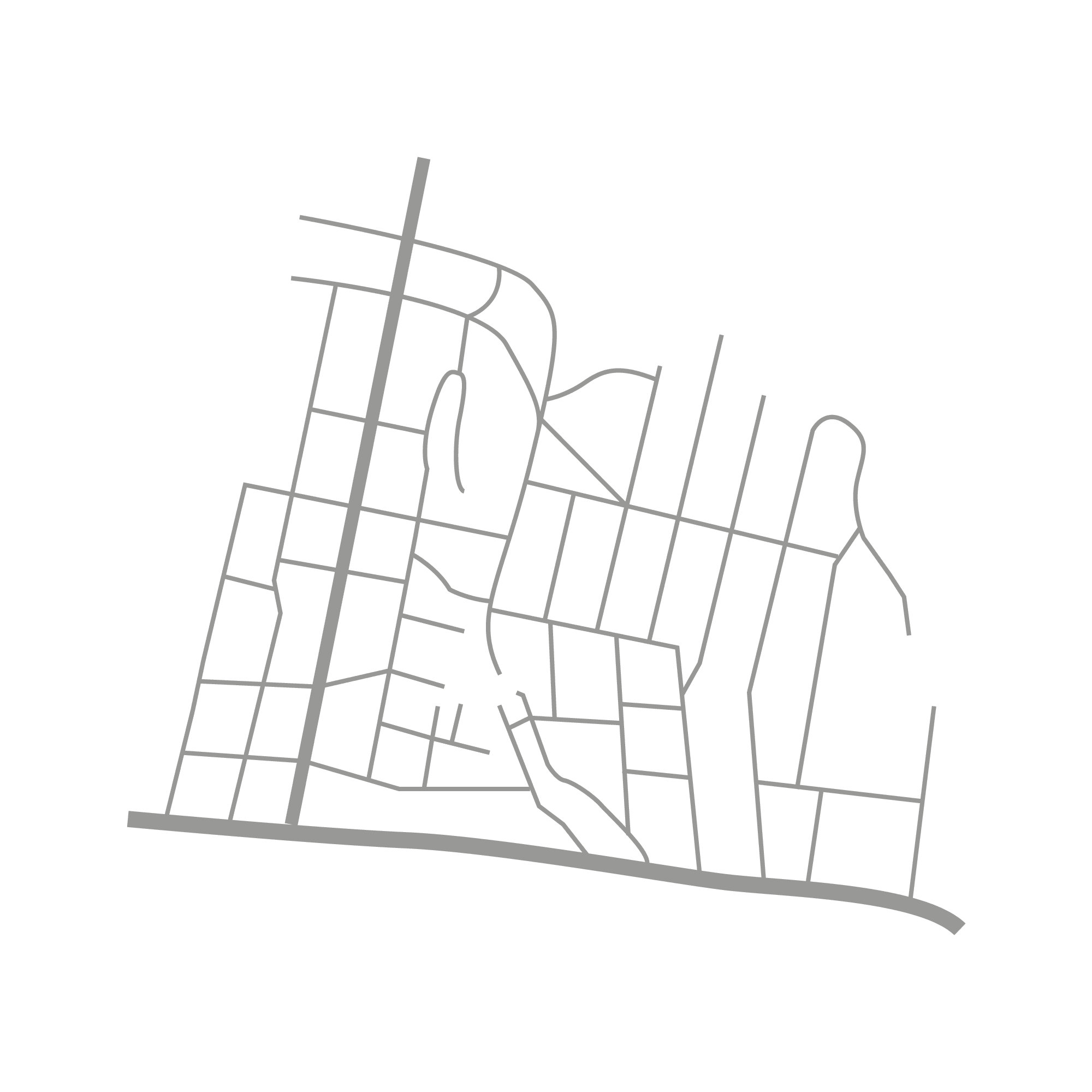
The goal: evoke sentiments of Charlotte locals so that they know their marketing partner is close to home. While there is no wood iconography in the actual logo to represent the Plaza Midwood area of Charlotte, there is a woodcut font. Taking out the holes in letters gives a primitive but friendly feel. The circle icon has an overlay of the Midwood area road map.

The Mini Map Of Midwood
By looking at maps of Charlotte we created a map icon that embodies the Plaza Midwood area.
